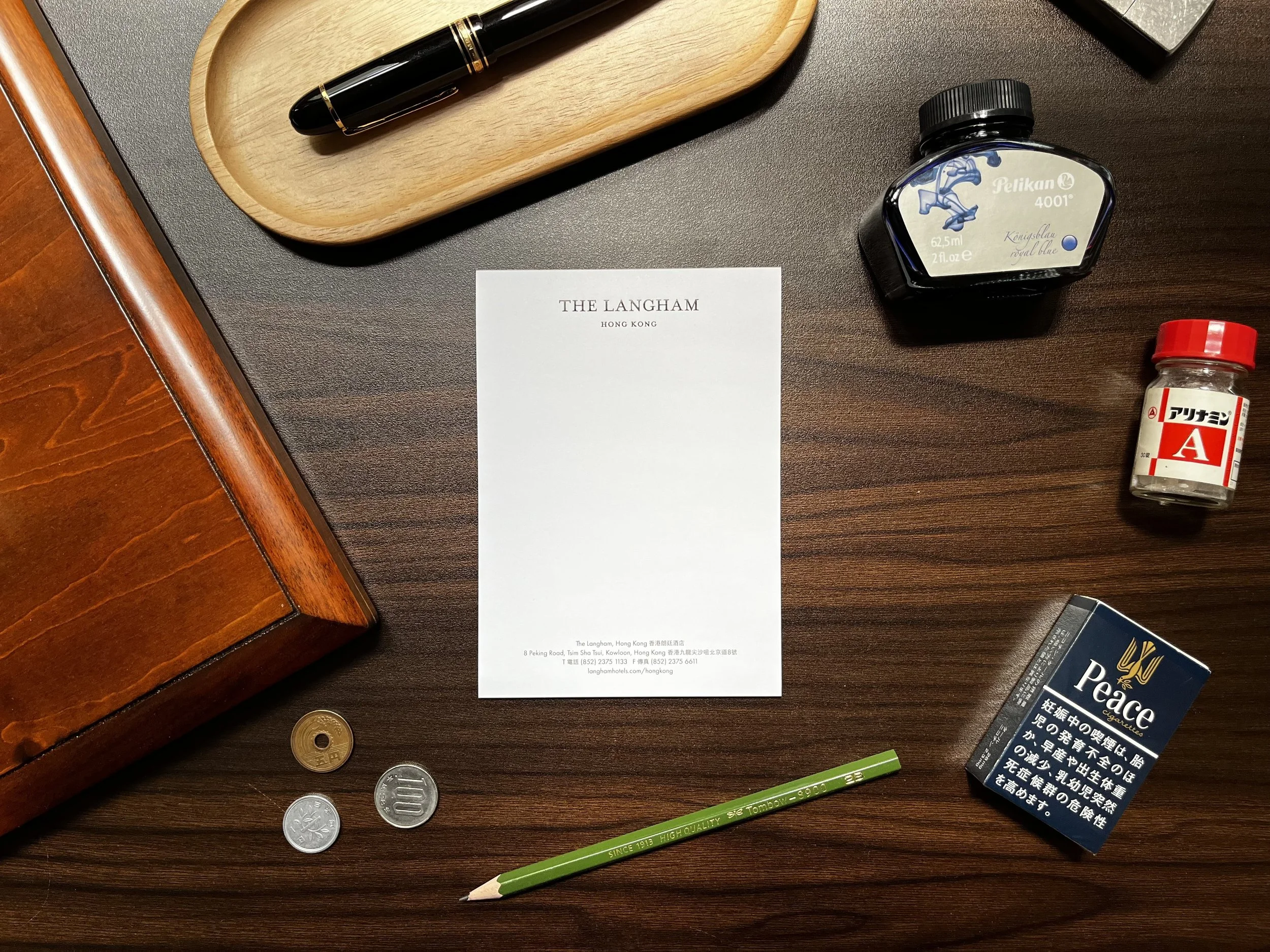
Hotel Stationery: The Langham Hong Kong
Hong Kong is a city steeped in history, culture, and cuisine. There's a certain, captivating beat to it—millions moving through vein-like streets, all twisted together, powering one of the most densely populated places on earth. It's been ten years since my last visit. Old friends and restaurants I have not returned to sit with me more than I’d like to admit. My parents, on their last visit, offered to bring some souvenirs to soothe the longing. Hong Kong has egg tarts, char siu puffs, and sweets that have no business being as good as it is. I asked them to get me some hotel stationery.
I imagine that when my parents explained the stationery was for their child, the staff pictured an actual child. Not a grown adult with opinions about optimal gsm and texture. An actual child, small and sticky-fingered, expecting a colouring book. The evidence supports this. The stationery arrived in a pink envelope, and some of the stationery inside had clearly seen some things. What's missing is a sticker.
Thankfully, the memo pad was in excellent condition.
The memo pad arrived unscathed. Unfortunately, the A4 paper and letter envelope did not share the same fate.
The Langham, Hong Kong—Memo Pad
Nothing about this memo pad tries to win you over. The proportions are familiar, and the construction is what you’d expect: a small pad with ten sheets—enough to survive a short stay’s worth of souvenirs-to-buy, directions relayed over the phone, and “what was the reservation name again?” details.
With my control setup (Montblanc 149, medium, Pelikan Royal Blue), the ink bleeds through, but it doesn’t feather. Ink immediately disappears into the fibers when put down, no pooling whatsoever. Translation: fountain pens are usable as long as you accept it as a front-page-only relationship.
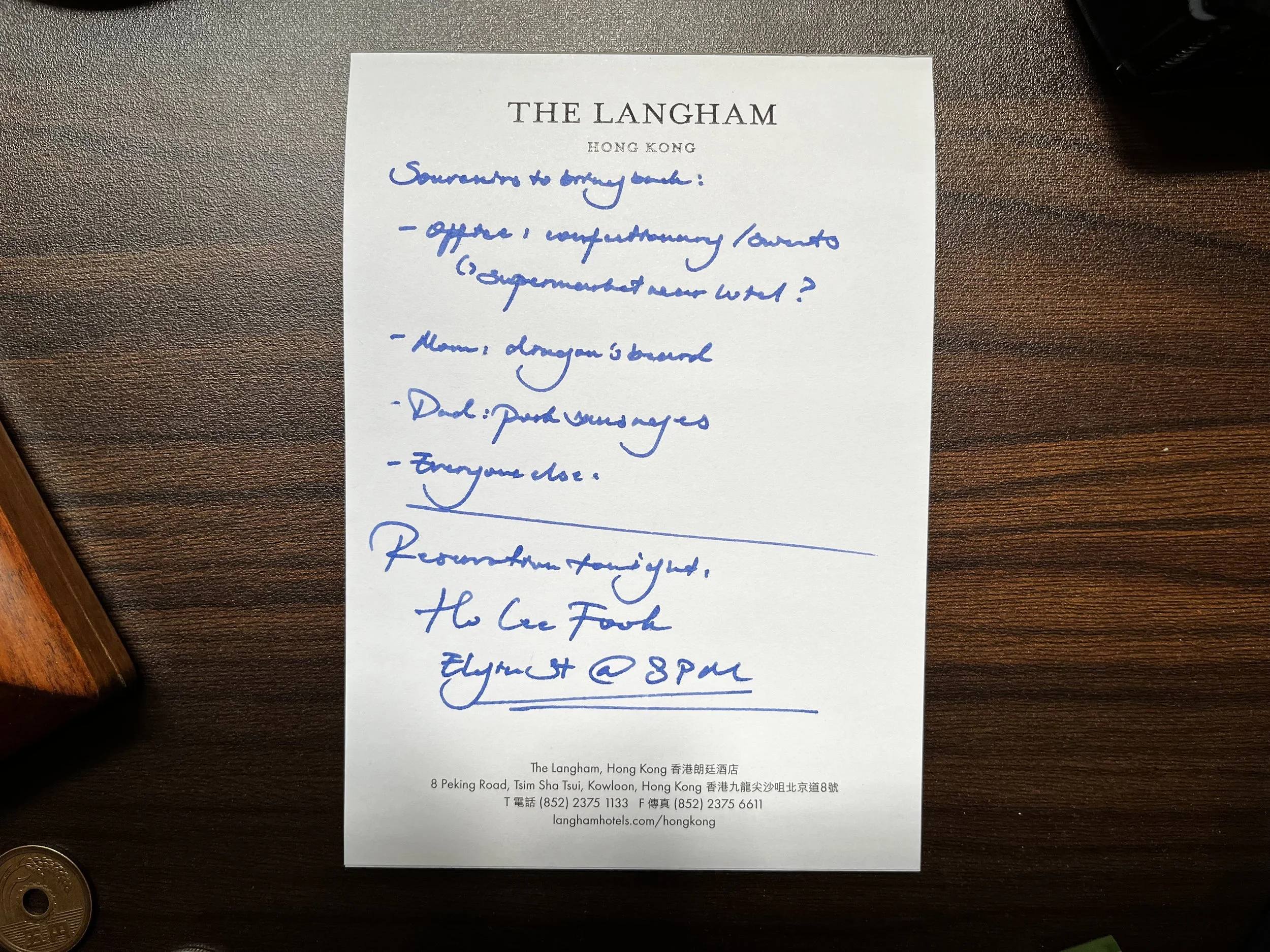
Pelikan’s Royal Blue looks expectedly flat on this paper.
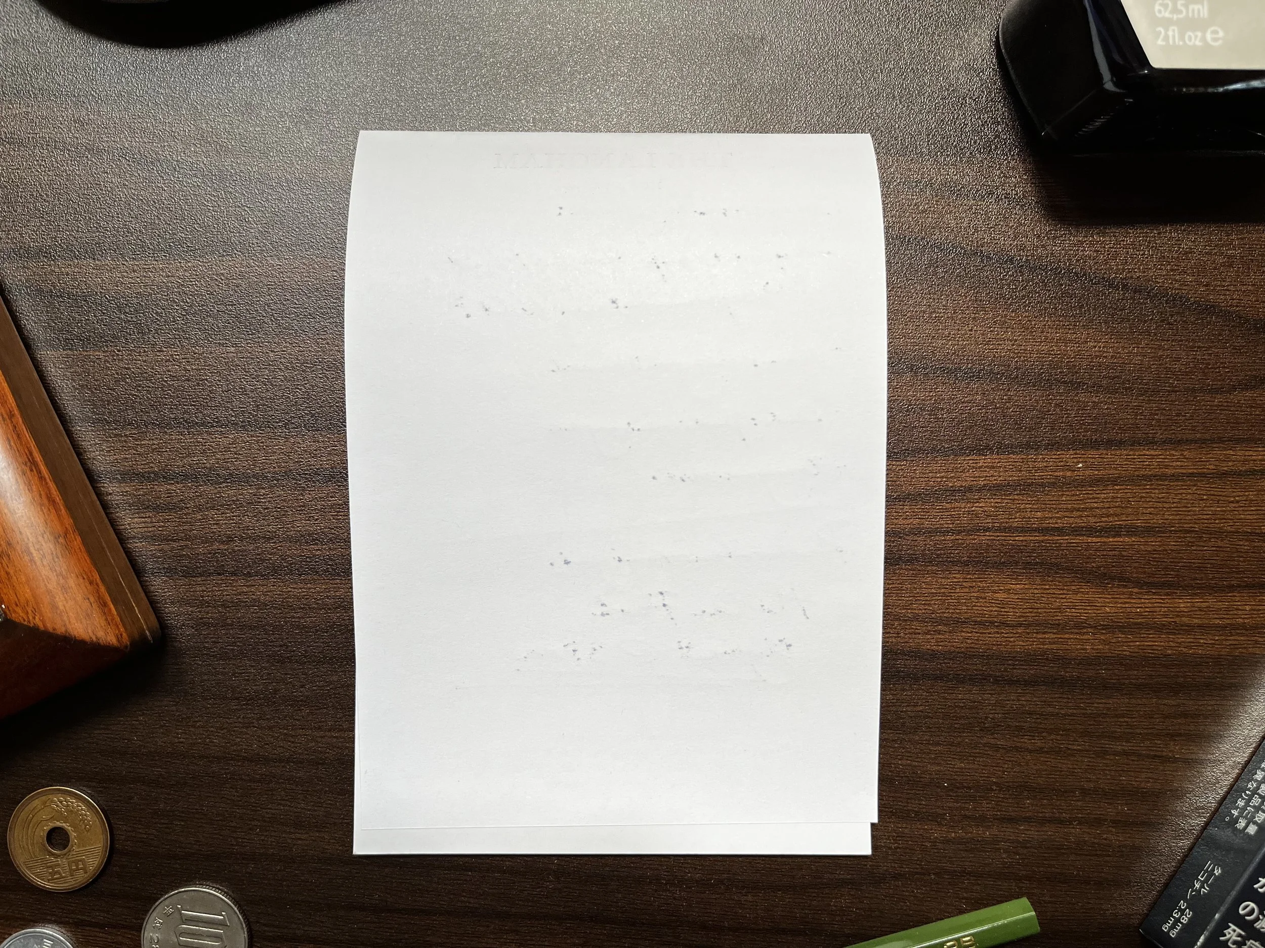
Pelikan’s Royal Blue, a relatively dry ink, bleeds through this paper.
Texture-wise, the paper is smooth—soft, even. On this pad, my 149 (wet, but with some deliberate feedback) feels oddly muted, like someone put a thin blanket over the nib. If you like Rhodia’s slickness, you’ll recognize the sensation immediately: controlled but anesthetized.
Branding is minimal at first glance. The logo is quiet enough to disappear after the first couple of sentences—until you look back and realize it’s in all caps, calmly insisting on being read. It doesn’t scream, but it does signal. If I received a note written on this pad, I’d assume the writer has a taste for things that are meant to be noticed, though not necessarily things worth noticing.
Writing feel: 3/10
Fountain-pen friendly: 3/10
Julia-Roberts-evoking: 2 Neapolitan pizzas out of 10
—Montblanc 12, Montblanc Irish Green
-
June 2026
- Jun 22, 2026 In Defense of the Converter
- Jun 12, 2026 King Profit
- Jun 5, 2026 Komeda’s Coffee in Bali
-
May 2026
- May 16, 2026 Japanese Ateliers (III): Kato Seisakusho
-
April 2026
- Apr 26, 2026 400NN
- Apr 12, 2026 On Ebonite Feeds
-
March 2026
- Mar 26, 2026 After the Ink Is Gone
- Mar 22, 2026 Hotel Stationery: The Langham Hong Kong
- Mar 19, 2026 Hotel Stationery: The Aman Tokyo
-
February 2026
- Feb 22, 2026 Japanese Ateliers (II): Hakase
- Feb 14, 2026 Japanese Ateliers (I): Nakaya
- Feb 7, 2026 The Price of Writing in Gold
-
January 2026
- Jan 31, 2026 The True Heir
- Jan 24, 2026 Lifestyle