After the Ink Is Gone
Eizo Fujii of Eurobox is colourblind.
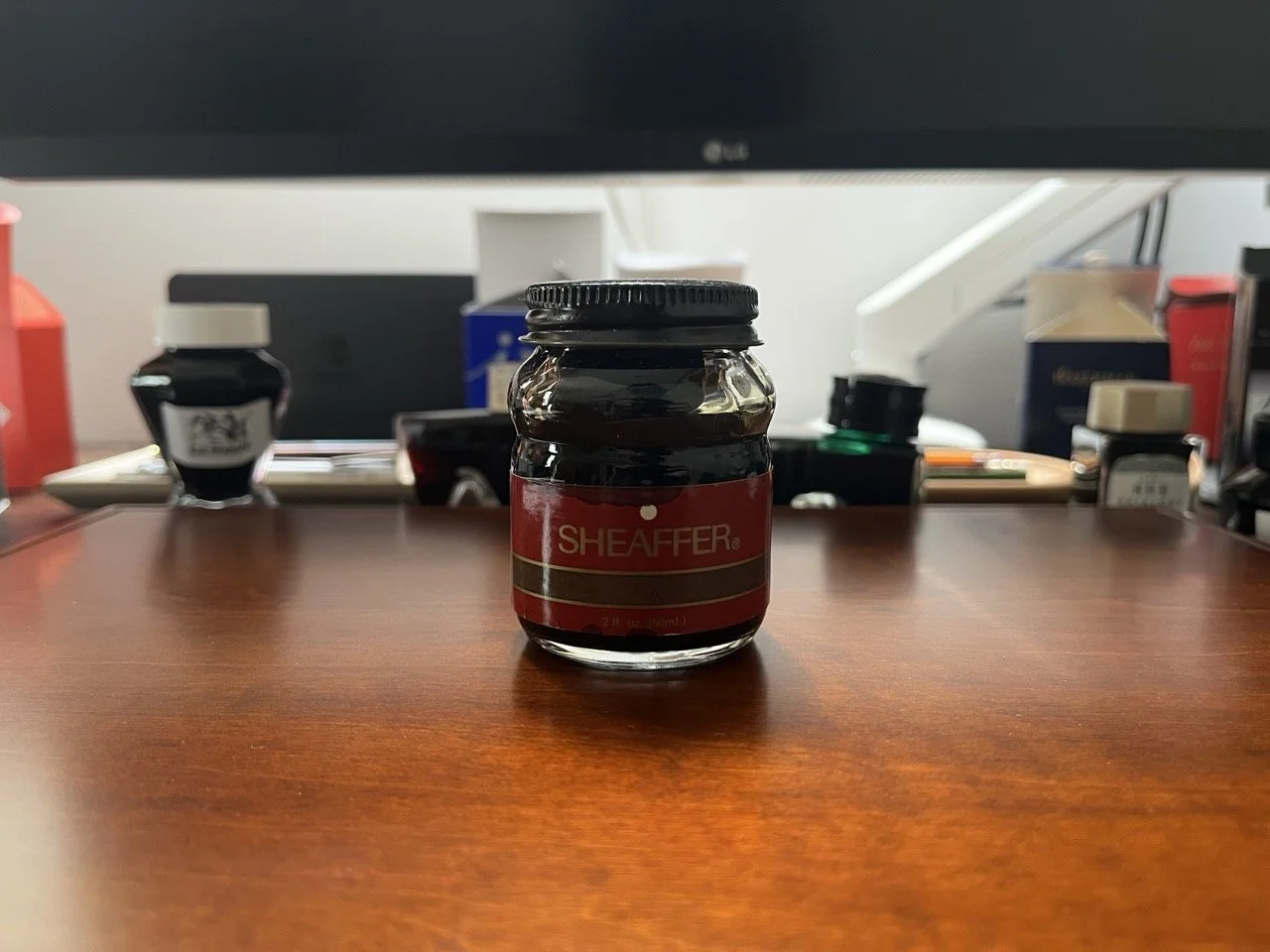
I didn't know this until the end of an afternoon I'd spent sitting across from him, trying pens, talking about Vancouver, eventually buying a Montblanc 254. When I asked if he had any green ink to go with my new pen, he pulled out a box and told me to have a look. I rummaged through it and held up a Sheaffer bottle because something about the shape arrested me. He smiled and gave it to me.
The cap is rusted now. I can't use the ink. I can't throw out the bottle.
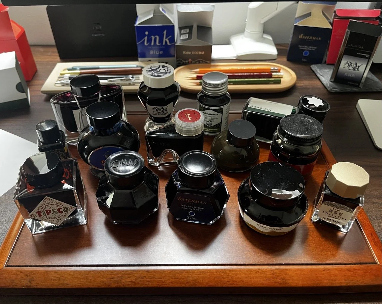
That tension is what got me thinking about ink bottles in the first place. What they are, what they're for, and whether those two things are always the same. From what I've observed, manufacturers work from one of three philosophies when designing them.
The first is to facilitate use. Waterman, Sheaffer (in its classic form), P.W. Akkerman, and Pilot's 70ml bottles all share the same underlying idea: the bottle should accommodate you when the ink runs low. Sheaffer's old design achieves this with a built-in inkwell inside the bottle. Pilot and the original Sailor round bottle (now used by Nagasawa) use a plastic insert (similar to an ink miser) toward the same end. Montblanc's heel-shaped bottle takes a different approach: tilt it to rest on the small heel beneath the opening, and ink gathers there for easier filling. Each solution is different; the intention is the same.
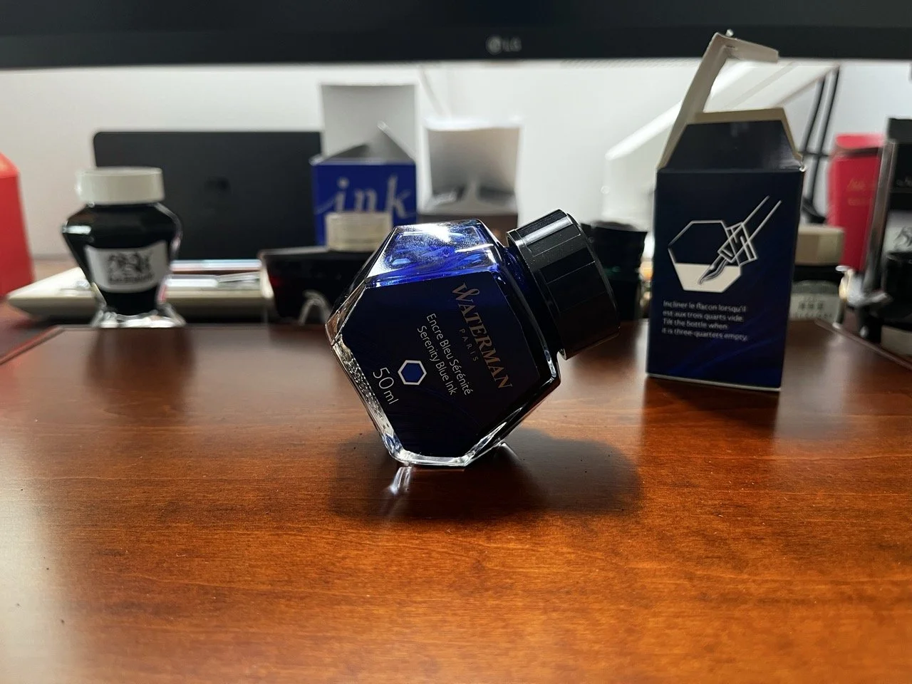
Waterman’s bottle design allows for easier refilling.
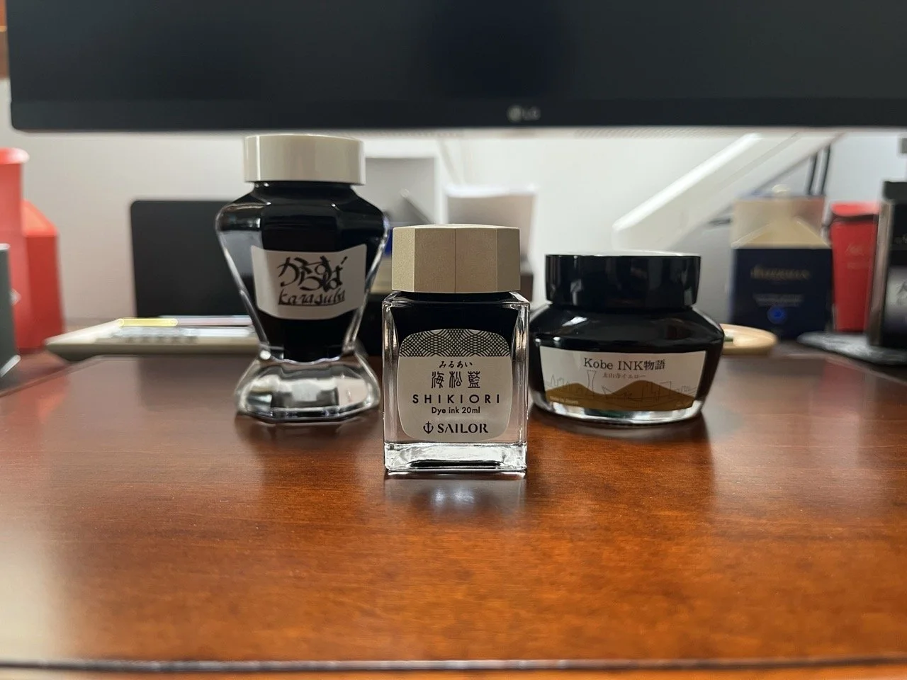
Three generations of Sailor ink bottles. The Nagasawa ink bottle with a built-in ink miser is on the right.
The second philosophy is to treat the bottle as an ornament. Bungubox's bottle is clearly descended from Montblanc's heel design, but the reasoning has been discarded. For Bungubox, the shape exists for dramatic effect. This is a defensible choice. Fountain pens, in this era, attract a particular kind of person. One for whom filling a pen is itself a considered act. If the medium is the message, then a bottle that rises to that occasion is part of the experience. Bungubox inks are made by Sailor, but the housing is their own. Securing that kind of exclusive, custom bottle at limited volumes cannot be cheap, and the price reflects it. It harkens back to Pilot's Iroshizuku line in its early days, before volume brought the cost down.
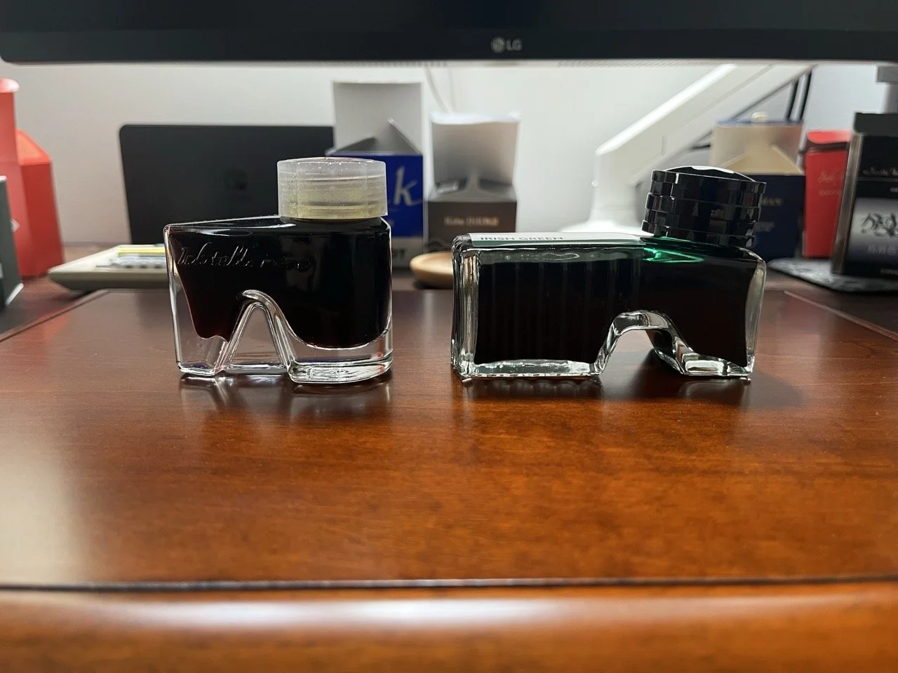
Bungubox’s ink bottle (left) compared to Montblanc’s (right).
The third is to minimise cost. Glass is heavy, fragile, and expensive to produce. Plastic is none of those things. Diamine and Robert Oster have made this calculation, and it is a rational one. The question is whether it alienates the kind of consumer who buys bottled ink. Bottled ink is a luxury product by any measure, bought by choice. That concern is real, even if not everyone shares it.
So: are ink bottles containers, or objects? The Sheaffer on my desk answers the question without being asked. Its ink is unusable. Its purpose, in the practical sense, has expired. And still it sits there, because it's holding something else now. Something Fujii-san put there without knowing it, on an afternoon when he handed me a colour I’m not sure he’d ever seen.
—Pelikan 400NN, Rohrer & Klingner Alt-Goldgrün
-
June 2026
- Jun 22, 2026 In Defense of the Converter
- Jun 12, 2026 King Profit
- Jun 5, 2026 Komeda’s Coffee in Bali
-
May 2026
- May 16, 2026 Japanese Ateliers (III): Kato Seisakusho
-
April 2026
- Apr 26, 2026 400NN
- Apr 12, 2026 On Ebonite Feeds
-
March 2026
- Mar 26, 2026 After the Ink Is Gone
- Mar 22, 2026 Hotel Stationery: The Langham Hong Kong
- Mar 19, 2026 Hotel Stationery: The Aman Tokyo
-
February 2026
- Feb 22, 2026 Japanese Ateliers (II): Hakase
- Feb 14, 2026 Japanese Ateliers (I): Nakaya
- Feb 7, 2026 The Price of Writing in Gold
-
January 2026
- Jan 31, 2026 The True Heir
- Jan 24, 2026 Lifestyle